

COLOR
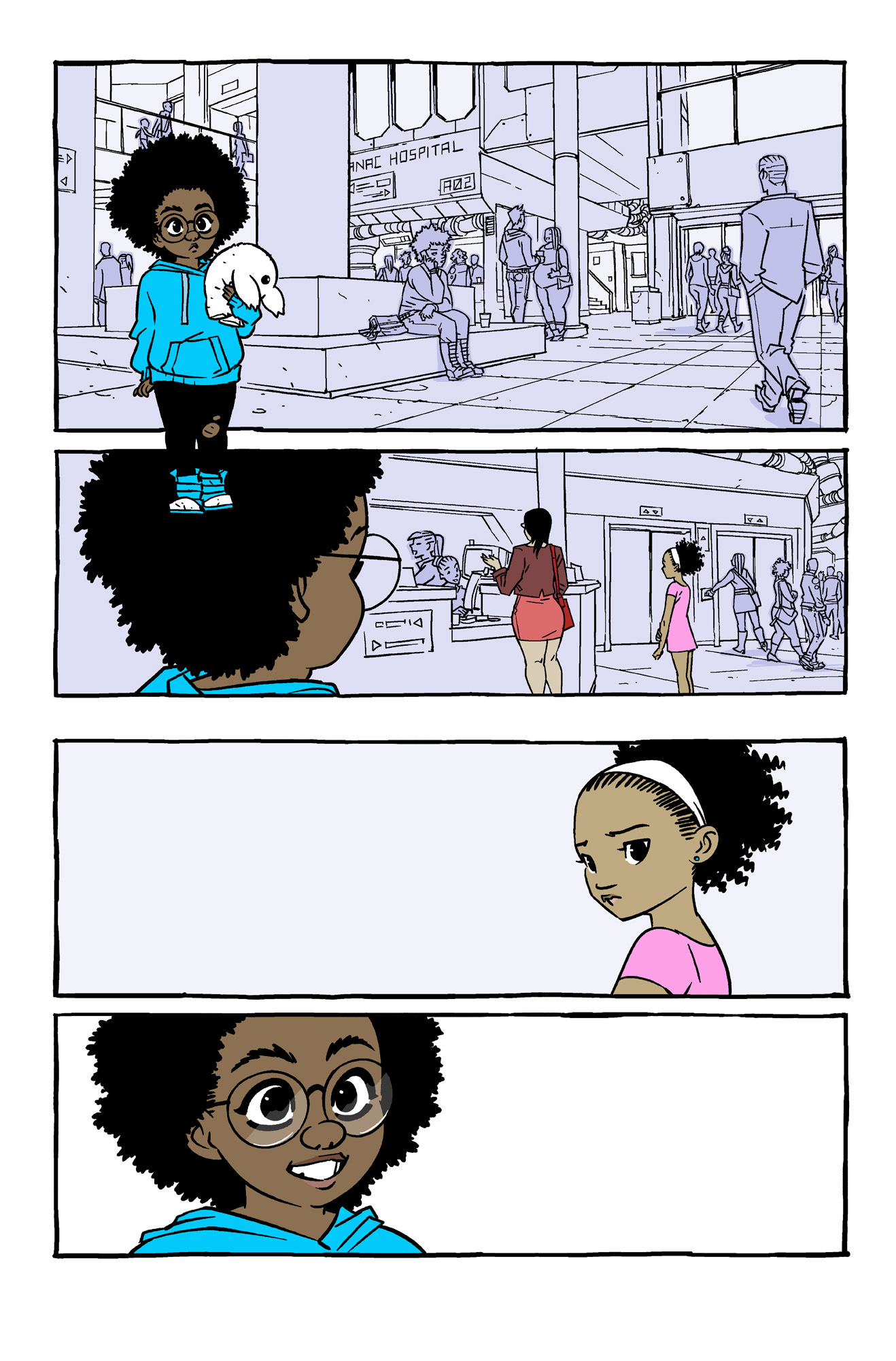
First Shadoweyes For Good page colors! I’m still tinkering with this a bit, the book starts off with a flashback so I wanted it to seem different and more dreamlike than the present day scenes. I’d planned on doing more literal colors for the backgrounds, coloring all the people and environments in full, but I ended up doing something more stylized. What do you guys think?
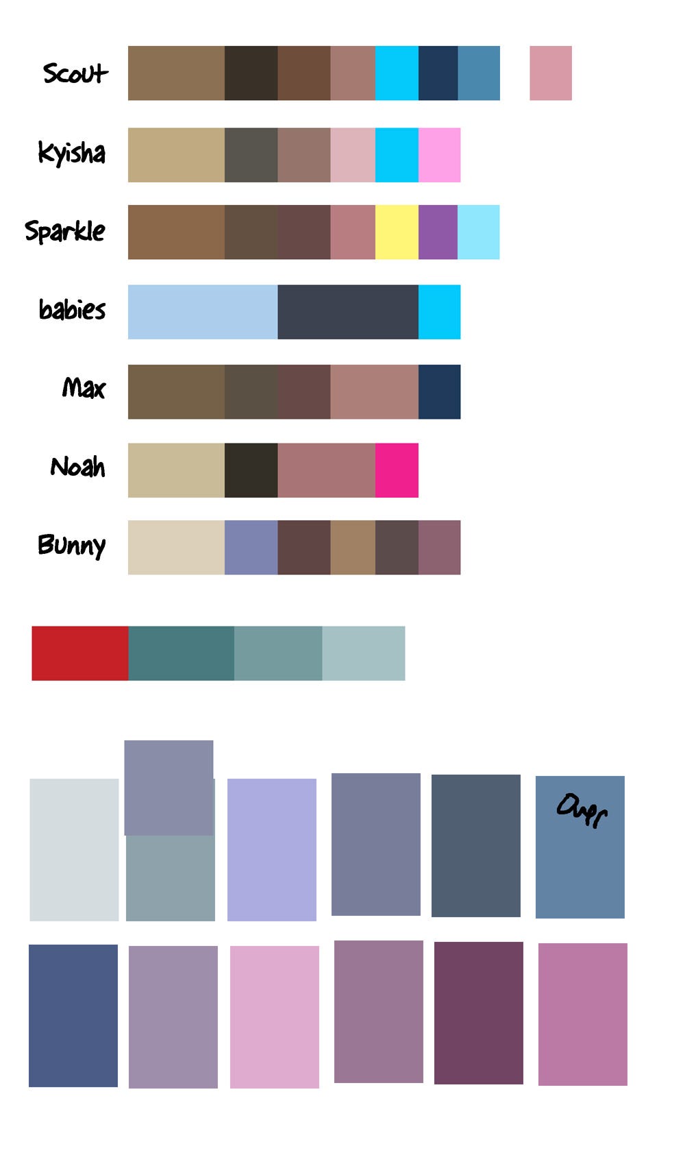
Also, here’s the palette I use for Shadoweyes colors so I can do quick color selection. Sometimes I’ll slightly change the characters’ colors depending on the scene, like if it’s night time or there’s some sort of overall lighting that might cast things in different colors. The square at the bottom that says “over” on it stands for overlay, a color I’ll throw on top of everything to give it a blue-ish tint.
First of all, I am dead from all the cuteness on this page. I will be missed.
But seriously, I think this color strategy works fine. I would suggest adding a *little* more shading/dark values to the background to make it look more finished.
On another note, it's so much fun to see more aspects of Dranac (is that right?), which shows the variety of the setting.
So cool!
First of all, I LOVE the limited color on that flashback, I'm a big fan of this approach generally and it looks great here! Second, these babies are so cute I wanna smush them. Third, these palettes are awesome.